John Carter by Michael Giacchino, one of my favourite scores of 2012 and arguably the only part of this Walt Disney Pictures production, that fully lived up to its expectations.
Giacchino composed one blast of a score, a full-circle adventure bombast, that leaves you desperately yearning for more. Unfortunately, that may never be, since the film bombed horrendously at the box office. Partially to blame for this mess is the completely bland and uninspired advertising campaign. And also the score album was fobbed off with a boring, conventional cover artwork. So it was time again for custom designers’ duties to honor the musical quality with proper jackets.


The first custom cover in this series (#1) was actually not created by myself, but by FSM Board member “Dalboz17“. I considered making a similar design first, but then came to the conclusion, that it couldn’t be improved in any way. I really like the clean look of it. The text allignment and spacing is just perfect on this one. I think Disney made a huge mistake by changing the film title (and its font design) to John Carter instead of John Carter of Mars (which has a natural flow in its pronunciation). I mean, just have a look at the logo treatment above, compare it to my remake of the original cover (#2) and then tell me which one’s more elegant and classy?


")


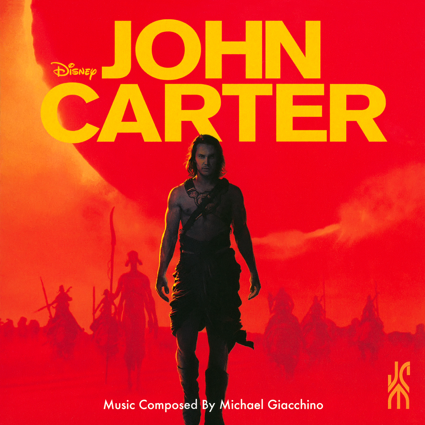
Since I first saw the films teaser trailer I absolutely wanted to make a custom cover based on the title card in it. From the beginning on I imagined a soundtrack cover with this red background pattern and the film logo as the main element in it. And to my surprise I was probably the first to have thought of such a thing. Reason could also be, that you could hardly find high resolution material to work with. I was lucky enough to stumble upon a trailer analysis website that posted HD screencaps of it. So I could compose a square cover out of several individual images and I can tell – not without pride – that the end result above (#3) is very close to my original idea.
I also made some variations (#4, #5) with different layering effects and style modifications (e.g. drop shadows, colour temperatures, gradients, text alignments etc.). The Academy Award Consideration album (#5) is wishful thinking by me, I doubt there really was this kind of thing. It should have been though, maybe then the score would have been recognized during Oscar season. An interesting side note on custom cover #8, I used the sky texture from cover #11 in the background, since none of my original ideas matched the foreground image that well.
For the three customs below (#11 to #13), I wanted to use all the different title designs I came up with during this series.


The background images used for that purpose made an excellent fit. I especially recommend on these closing artworks to view them in full size to get all the details. For example, a downscaled version of Mr. Carter to make room for Michael Giacchino’s album credits (#11). As a side effect it made the whole vista appear larger in scope also. Or the fading colour gradients of the film logo behind the bridge (#12). It’s the little details I love the most about these designs. I hope you enjoy this series as much as I do. I tried to create as many different designs as possible, so that you can choose from a colourful palette a cover to your liking.

Great art for a really great score, your work does it proud. This was one of my favourite films last year and my favourite score. Shame it all went so wrong for the film, I’d have loved to have seen some sequels. Great blog by the way.
LikeLike
[…] himself designed a really wonderful logo (which I kind of used in #5), but Disney watered it down once again and went for a more blander style by using the already overused […]
LikeLike
[…] himself designed a really wonderful logo (which I kind of used in #5), but Disney watered it down once again and went for a more blander style by using the already overused […]
LikeLike